
Line Graph IELTS Writing Task 1: Cách viết và bài mẫu band 7+
Line Graph luôn là một trong những dạng thường gặp nhất trong IELTS Writing Task 1. Bài viết sau đây sẽ hướng dẫn người đọc cách viết line graph và tổng hợp 10 IELTS Writing Task 1 Line Graph samples được biên soạn bởi đội ngũ chuyên môn tại Anh Ngữ ZIM.
Tham khảo thêm cách viết các dạng bài:
Bar Chart IELTS Writing Task 1
Table IELTS Writing Task 1
Pie Chart IELTS Writing task 1
Cách viết line graph IELTS Writing task 1
Dạng Line Graph (hay Line Chart) trong phần thi Writing Task 1 là dạng biểu đồ trong đó có chứa một số đường. Những đường này sẽ biểu diễn cho một sự thay đổi của một yếu tố nào đó qua nhiều mốc trong một khoảng thời gian (tuần, tháng, năm, thập kỷ,…). Nhiệm vụ của thí sinh là viết một đoạn văn ít nhất 150 từ miêu tả thông tin hiển thị trong biểu đồ nhưng không nêu quan điểm của mình trong bài viết. Để hoàn thành bài viết line gaph, ta có 4 bước:
Bước 1: Phân tích đề bài
Bước 2: Viết introduction
Bước 3: Xác định ý và viết overview
Bước 4: Lựa chọn, nhóm thông tin và viết 2 đoạn detail.
Tiếp theo tác giả sẽ áp dụng 4 bước để hướng dẫn người đọc áp dụng cách viết cho 2 dạng trong line graph trong IELTS Writing task 1 dưới đây:
Dạng line graph có ít hơn 3 đường
Dạng line graph có nhiều hơn 3 đường.
Cách viết line graph IELTS Writing task 1 dạng có ít hơn 3 đường
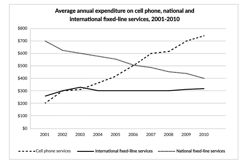
Đề bài: The graph below shows consumers’ average annual expenditure on cell phone, national and international fixed-line and services in America between 2001 and 2010.
Bước 1: Phân tích đề line graph IELTS Writing task 1 dạng có ít hơn 3 đường
1. Đối tượng (chủ ngữ) của biểu đồ là gì?
Đối tượng được đưa ra ở đây là sự chi tiêu hàng năm (lượng tiền). Chủ ngữ ở đây là “The amount of money spent on cell phone services/ national fixed-line services/ international fixed-line services” Hoặc “Average yearly spending/expenditure on cell phone services/national fixed-line services/ international fixed-line services”.
2. Đơn vị là gì?
Đơn vị được tính bằng $ - dollar.
3. Có mốc hay khoảng thời gian không? Thì của động từ?
Khoảng thời gian trong 9 năm bắt đầu từ năm 2001 → dùng thì quá khứ đơn xuyên suốt cả bài.
Bước 2: Viết introduction - Paraphrase đề bài
Subject: The chart => The line graph.
Verb: shows => illustrates.
WHAT - WHERE - WHEN: US consumers’ average yearly expenditure on cell phone services, and, national and international fixed-line services in America between 2001 and 2010. => The average amount of money spent anually on mobile phone services, and, national and international landline services in the US over a period of 9 years.
Introduction hoàn thiện:
The line graph illustrates the average amount of money spent anually on mobile phone services, and, national and international landline services in the US over a period of 9 years.
Bước 3: Xác định ý và viết Overview
Tìm 1-2 đặc điểm chung của biểu đồ line graph. Với dạng biểu đồ đường (có xu hướng), Overview được viết theo 2 ý sau:
Đặc điểm về xu hướng: nhìn từ đầu năm đến cuối năm xem xu hướng của các đường là gì? Là tăng? giảm? dao động liên tục? hay giữ nguyên?
Đặc điểm về độ lớn: Xác định đường có số liệu cao nhất, thấp nhất, hoặc thay đổi lớn nhất.
Áp dụng vào bài:
Đặc điểm về xu hướng: Một đường có xu hướng tăng (cell phone services), một đường có xu hướng giảm (national fixed-line services), một đường gần như giữ nguyên trong cả giai đoạn (international fixed-line services).
Đặc điểm về độ lớn: Không có đường nào nằm cao nhất hoặc thấp nhất trong suốt quá trình, tuy nhiên có thể thấy đường international fix-lined services ở vị trí thấp nhất trong hầu hết các năm.
Từ 2 đặc điểm trên, đoạn overview có thể được viết dưới đây:
It is clear that while the yearly spending on mobile phones increased significantly, the opposite was true for national landline phone expenditure. Also, the figure for international fixed-line services was lowest during the period.
Lưu ý:
Cụm từ “It is clear that” là một cụm rất phổ biển để sử dụng mở đầu cho phần Overview cho tất cả các bài Writing Task 1 không chỉ riêng biểu đồ đường.
Cấu trúc “while S+V, S+V” dùng để so sánh giữa 2 xu hướng trái ngược nhau (ví dụ 1 tăng, 1 giảm) của 2 nhân tố được mô tả trong biểu đồ, giúp biến câu thành 1 câu phức.
Cụm từ “the opposite was true for something (điều ngược lại thì đúng cho…)” cũng là một cụm có thể áp dụng cho các bài task 1 khác, vừa ăn điểm từ vựng vừa tránh lặp lại chủ ngữ đã trình bày trước đó.
Cụm từ “over the period” được thay thế cho cụm “over a period of 9 years starting from 2001” để tránh việc lặp từ.
Xem chi tiết: Cách paraphrase đề bài IELTS Writing Task 1.
Bước 4: Lựa chọn, nhóm thông tin và viết 2 đoạn Detail

Với dạng line graph dưới 3 đường, cách nhóm thông tin hiệu quả đó là chia đôi quãng thời gian của biểu đồ rồi phân tích cho 2 đoạn detail, cụ thể:
Detail 1: So sánh các đường ở điểm đầu, xu hướng cho đến điểm giữa (2001-2006).
Năm 2001: số tiền lớn nhất là chi cho national fixed-line services khoảng $700, trong khi con số đó ở international fixed-line services chỉ là $250 và cell phone services chỉ $200 (lưu ý: bắt đầu Detail 1 thường là câu so sánh số liệu các đường ở năm đầu tiên).
5 năm tiếp theo: chi tiêu trung bình hàng năm của national fixed-line services giảm đi khoảng $200, ngược lại chi tiêu cho cell phones tăng thêm khoảng $300. Chi tiêu cho International fixed-line services dao động trong khoảng dưới $300.
Lưu ý: Những năm 2002, 2003, 2004 không chứa số liệu nổi bật nên chỉ cần miêu tả xu hướng cho đến năm 2006.
Đoạn detail 1 hoàn thiện của bài line graph:
In 2001, there was an average of nearly $700 spent on national landline phone services by US residents, in comparison with only around $200 each on mobile phone and international landline services. Over the next five years, the average amount spent on national fixed-line phone services fell by approximately $200. By contrast, yearly spending on cell phone services witnessed a significant increase of roughly $300. At the same time, the figure for overseas landline services fluctuated slightly below $300.
Detail 2: Xu hướng từ điểm giữa đến điểm cuối, so sánh điểm cuối (năm 2006 - hết)
2006: số liệu cho national fixed-line và cell phone services bằng nhau ở mức $500.
Từ 2006-2010: cell phone services tiếp tục tăng và đạt gần $750, trong khi national fixed-line services giảm xuống còn khoảng $400. Chi tiêu cho international fixed-line services giữ nguyên trong giai đoạn này.
Lưu ý: Tương tự những năm 2007, 2008, 2009 không chứa số liệu nổi bật nên chỉ cần miêu tả xu hướng cho đến năm cuối cùng.
Đoạn detail 2 hoàn thiện của bài line graph:
In 2006, US consumers spent the same amount of money on mobile and national fixed-line services, with just over $500 on each. From the year 2006 onwards, it can be seen that the average yearly expenditure on mobile phone services surpassed that of national fixed-line phone services and became the most common means of telecommunication. To be more specific, yearly spending on mobile phone services increased to nearly $750 in the final year, while the figure for national landline phone services decreased to about $400 by the end of the period. During the same period, there was stability in the figure for overseas phone services.
Tìm hiểu thêm: Miêu tả xu hướng trong IELTS Writing Task 1.
Cách viết line graph IELTS Writing task 1 dạng nhiều hơn 3 đường
Với dạng có nhiều hơn 3 đường (thường là 4-5 đường), việc viết đoạn introduction và rerview hoàn toàn tương tự với dạng từ 3 đường trở xuống, chỉ khác ở cách chia thông tin viết ở 2 đoạn detail không nên chia theo thời gian nữa mà nên chia theo các đường, cụ thể như sau:
Detail 1: Miêu tả và so sánh 2-3 đường (thường chọn đường có cùng xu hướng tăng/giảm hoặc cùng có giá trị lớn/nhỏ).
Detail 2: Miêu tả và so sánh các đường còn lại.

Bước 1: Phân tích đề line graph dạng nhiều hơn 3 đường
1. Đối tượng (chủ ngữ) của biểu đồ là gì?
Đối tượng được đưa ra ở đây là phần trăm khách du lịch đến Scotland.
2. Đơn vị là gì?
Đơn vị được tính bằng %.
3. Có mốc hay khoảng thời gian không? Thì của động từ?
Khoảng thời gian trong 30 năm bắt đầu từ năm 1980 nên bài viết sẽ dùng thì quá khứ đơn xuyên suốt cả bài.
Bước 2: Viết Introduction - Paraphrase đề bài
Đề bài: The chart graph shows the percentage of tourists to Scotland who visited four different types of attractions from 1980 to 2010.
Introduction:
The line chart illustrates the percentage of visitors to four types of places in Scotland, including aquariums, castles, zoos and festivals over a period of 30 years.
Bước 3: Xác định ý và viết Overview
Tương tự phần trước (loại line graph 3 đường trở xuống), Overview được viết dựa trên 2 đặc điểm sau:
Đặc điểm về xu hướng: Hai đường có xu hướng tăng (Castle & Zoo), Hai đường có xu hướng giảm (Festival & Aquarium).
Đặc điểm về độ lớn: Đường Castle cao nhất cho phần lớn quá trình (tương tự, đường Zoo thấp nhất cho phần lớn quá trình).
Overview hoàn thiện:
It is clear that while the percentage of tourists visiting castles and zoos increased, the opposite was true for aquariums and festivals during the period. It is also notable that castles were the most popular tourist attraction in Scotland for most of the period.
Lưu ý:
Các cấu trúc quen thuộc vẫn được sử dụng: Cấu trúc while S + V, S+ V, cụm từ “it is clear that”, “it is also notable that”, “the opposite was true for” và “over the period”.
Cụm “for most of the period” có nghĩa là cho phần lớn quãng thời gian của biểu đồ (>80%).
Khi nói về đường cao nhất, cấu trúc so sánh hơn nhất sẽ được sử dụng: subject + be + the + Adj ở dạng so sánh nhất + noun. Ví dụ trong bài là “Castle was the most popular tourist attraction”.
Bước 4: Nhóm thông tin và viết 2 đoạn Detail cho dạng line graph nhiều hơn 3 đường

Detail 1: Nhóm Miêu tả Castle và Zoo (cùng có xu hướng tăng):
1980: Lượng khách đến thăm Castle (nearly 25%), trong khi Zoo (~10%).
Từ năm 1980-2000: Lượng khách đên thăm Castle tăng mạnh để đạt đỉnh khoảng 45% năm 1995 trước khi giảm xuống còn 35% vào năm 2000. Tuy nhiên, lượng khách đến Zoo chỉ dao động quanh 10-15%.
Những năm còn lại: Trong khi lương khách đên Castle tiếp tục giảm nhẹ (xuống 33%), lượng khách đến zoo tăng (20%).
Đoạn detail 1 hoàn thiện của bài line graph:
In 1980, the percentage of tourists who chose to visit castles was nearly 25%, which was significantly higher than the figure for zoos, at only 10%. Over the following 20 years, the percentage of castle visitors increased dramatically to reach a peak of about 45% in 1995, followed by a considerable drop to just over 30% in 2010. By contrast, despite some minor fluctuations around 10 to 15% during the first 20 years, the figure for zoo visitors then significantly increased to 20% in the final year.
Detail 2: Nhóm còn lại Aquarium và Festival (cùng có xu hướng giảm):
1980: Lượng khách đến thăm Festival là lớn nhất (30%), khi Aquarium (~20%)
Aquarium: Đạt đỉnh khoảng 35% trước khi giảm về số liệu ban đầu → sau đó tiếp tục giảm mạnh xuống dưới 10% vào năm cuối.
Festival: Giảm dần trong cả quá trình xuống còn dưới 20% vào năm cuối.
Đoạn detail 2 hoàn thiện của bài line graph:
Looking at the other attractions, festivals were the most popular in 1980 with 30% of tourists choosing this, compared to 20% visiting aquariums. Over the next five years, the percentage of travellers paying a visit to an aquarium reached a peak of nearly 35% in 1985 before decreasing back to 20% five years later. Since then, this figure continued to fall significantly to just under 10% in 2010. Meanwhile, the percentage of festival visitors experienced a gradual decrease throughout the period, ending up at roughly 25% at the end of the period.
IELTS Writing Task 1 Line Graph Sample
Bài mẫu dạng có nhiều hơn 3 đường
Đề bài: The diagram shows the consumption of renewable energy in the USA from 1949-2008. Write a 150-word report for a university lecturer identifying the main trends and making comparisons where relevant.

Bài mẫu:
The line graph shows growth in the consumption of renewable energy during the period 1949-2008 in the USA. The results are also broken down by source.
The first thing to note is that renewable energy use more than doubled over the period, with particularly strong growth in biofuels. This sector did not exist in 1980 but experienced a steep rise during the 2000s to over one quadrillion Btu per year. This made biofuels a serious challenger to both wood and hydroelectric power, which both saw only limited growth overall. The former grew steadily between 1975 and 1985, but then slipped back to around its original level of 1.8 quadrillion Btu. The latter began the period at the same level as wood but experienced more substantial growth. However, it also fell back to around 2 quadrillion Btu, with a particularly sharp drop in the late 1990s.
Finally, wind power emerged late in the period but showed a gradual rise to around 0.5 quadrillion Btu, suggesting that it, along with biofuels, will replace wood and hydroelectricity as the main sources of renewable every in the future.
Bài mẫu dạng có 3 đường
Đề bài: The graph below shows the number of overseas visitors to three different areas in a European country between 1987 and 2007.

Bài mẫu:
The given line graph depicts information about how many foreigners visited three separate regions in a European nation, during the span of a 20-year period from 1987 to 2007.
Overall, the most notable detail is that those three regions all attracted an increasing number of foreigners. In addition, the lakes’ tourist figures witnessed the most dramatic change among those given.
In more detail, at approximately 10,000 visitors in 1987, the quantity of foreign travelers who were attracted to the lakes gradually rose to around 50,000 in 2000, before peaking at approximately 75,000 tourists in 2002, This figure then dropped back down to approximately 50,000 people in 2007.
With regards to tourist numbers in coastal and mountainous areas, the overall figures increased, however mountainous areas remained the least attractive travel option out of the three. In 1987, the number of those who chose the coast as a travel destination stood at 40,000, compared to only 20,000 travelers who went to the mountains. In the next 14 years, the coast witnessed a slight decrease in the quantity of visitors by a few thousand, which was followed by a significant climb to around 60,000 people, whereas the number of those visiting mountainous areas went up remarkably to 30,000 in 2001. In the final 6 years, while the quantity of overseas tourists going to the coast rose moderately to above 70,000, there was a slight climb in those who paid a visit to the mountains to about 35,000.
Bạn có thể Tải trọn bộ 15 bài mẫu dạng biểu đồ đường miễn phí TẠI ĐÂY.
Tổng hợp: Bài mẫu IELTS Writing Task 1 dạng Line Graph.
Tổng kết
Đây là một bài viết hướng dẫn chi tiết về cách viết dạng bài Line Graph trong IELTS Writing Task 1 và cung cấp bài mẫu học viên band 7+ để học viên tham khảo. Nếu học viên quan tâm đến việc nâng cao kỹ năng của mình trong việc làm bài tập Line Graph và các dạng bài khác trong IELTS, học viên có thể tham gia khóa học IELTS nâng cao của ZIM.
Khóa luyện thi IELTS nâng cao sẽ giúp học viên rèn kỹ năng và thực hành làm các bài tập IELTS trình độ cao hơn (trên 5.5). Trong khóa học này, học viên sẽ được hướng dẫn cách làm các dạng bài khó hơn, cung cấp các chiến lược giải đề hiệu quả, và có cơ hội thực hành qua các bài tập và đề thi mô phỏng. Điều này sẽ giúp học viên tự tin và sẵn sàng cho kỳ thi IELTS.
Link nội dung: https://unie.edu.vn/cach-lam-bai-writing-a50893.html